The J. Paul Getty Museum presents Graphic Design in the Middle Ages, an exhibition that reveals the ways that design influenced the making, reading, and interpretation of medieval books. Drawn primarily from the Getty Museum’s Manuscripts collection, the exhibition goes on view at the Getty Center from August 29, 2023 through January 28, 2024.
“Medieval artists and scribes were innovative graphic designers, creatively crafting manuscripts that enticed readers into closely engaging with both text and image,” says Timothy Potts, Maria Hummer-Tuttle and Robert Tuttle Director of the Getty Museum. “They pioneered many of the page designs that we take for granted today, making this exhibition of great interest to anyone wanting to understand the creative process of designing and making books by hand in medieval times.”
Experimental design was a core component in the creation of medieval books. The people who produced them, from the scribe who wrote out the text to the artist who painted the images, were some of the world’s first graphic designers. They planned both individual pages and whole books, devising unique strategies for each work. The manuscripts on view explore the many ways in which words and images were designed to work together on the page, not just to communicate the content of the text but also to challenge, surprise, and delight readers.
“We tend to think of ‘graphic design’ as a modern thing, something that happens in primarily digital spaces,” said Larisa Grollemond, one of the curators of the exhibition. “But not only do we see in the Middle Ages the seeds of many of the design strategies that we still think of as part of reading books today, but medieval books are also masterclasses in delivering complex information in interesting and visually sophisticated ways.”
The exhibition’s first section, Designing the Medieval Page highlights the design and mechanics of medieval page layout depending on many factors, including the appropriate balance between words and images and the requirements of genre and audience. Each part of a manuscript was carefully planned during the early stages of production. While separate areas were designated for text and images, many aspects of the visual design were aimed at helping readers navigate the text.
Text as Design showcases how elements of text were frequently used as design tools to organize content and guide the reader. Large, elaborately decorated letters marking the beginnings of important passages were a central feature of manuscript design. Bright, contrasting colors also drew attention to important portions of the text, and sections were often distinguished by lettering of varied sizes. Rubrics, lines of text written in bright red ink or other eye-catching colors such as blue or green, signaled breaks in the text and provided readers with other helpful cues. On calendar pages, red and gold lettering signaled particularly important dates, such as feast days and other religious holidays.

Decorated Initial D, 1420-1430, English. Tempera colors, gold leaf, gold paint, and ink, 14 × 9 1/2 in. Getty Museum, Ms. 17 (85.MK.318), fol. 21
Visualizing Information draws attention to charts, tables, and diagrams that organized information spatially and legibly, offering a valuable window into the ways medieval people visualized knowledge. These graphic elements, ranging in complexity from simple geometric forms to elaborately designed and decorated images, served to connect ideas and helped viewers comprehend large amounts of data.
Lastly, Ornament and Abstraction, focuses on how medieval artists adopted a variety of approaches to ornamentation that enhanced and complicated the text. To engage fully with a manuscript, readers, therefore, needed a sophisticated understanding of both texts and images. Although images often illustrated or responded to the accompanying text, the connection between the two is not always obvious.
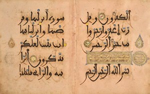
Image on top : Bifolium from the Pink Qur’an, 1200s, Spain. Tempera colors, gold, silver, and ink on paper. Getty Museum, Ms. 122 (2021.44.2)

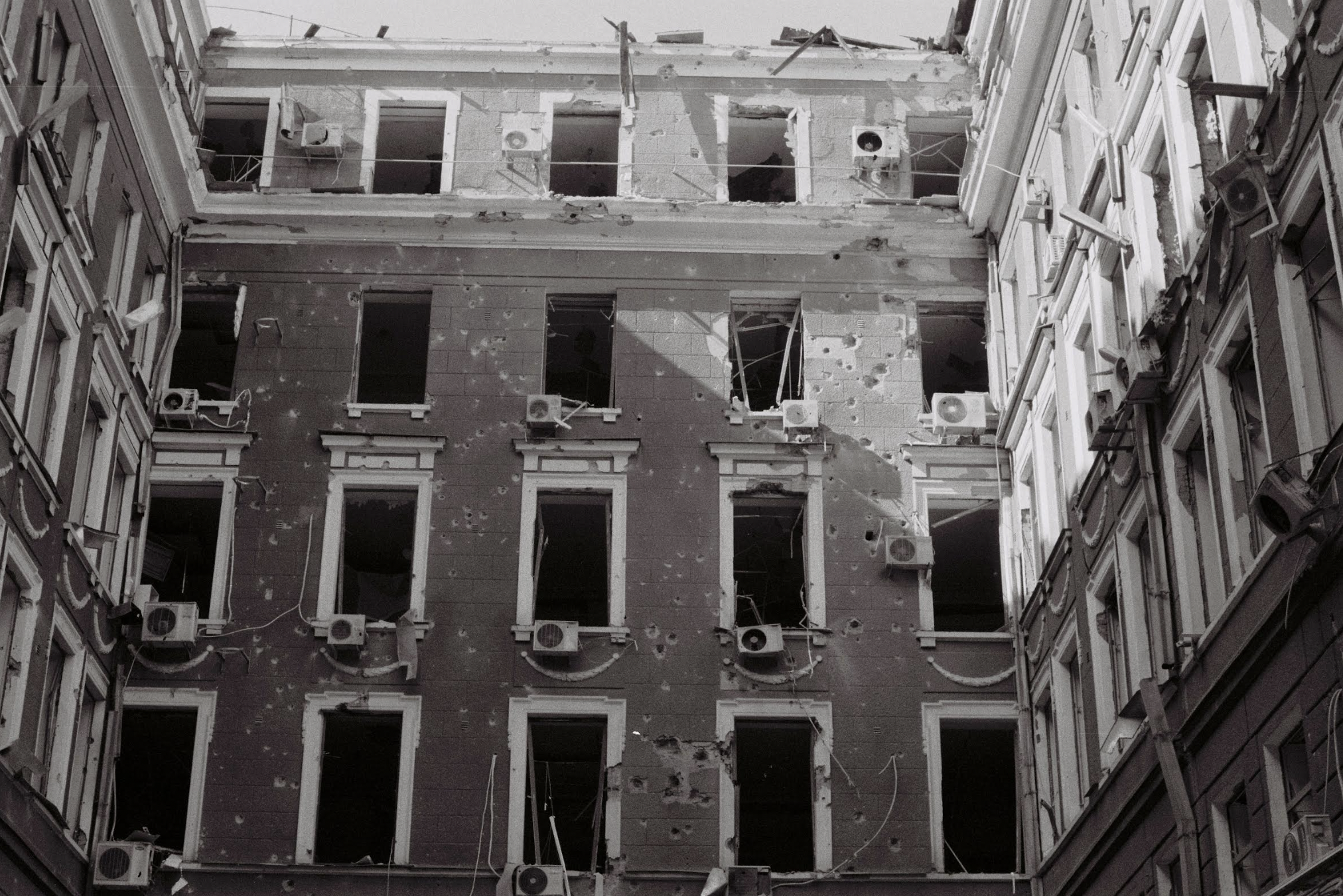
Anna Melnykova, "Palace of Labor (palats praci), architector I. Pretro, 1916", shot with analog Canon camera, 35 mm Fuji film in March 2022.
ArtDependence Magazine is an international magazine covering all spheres of contemporary art, as well as modern and classical art.
ArtDependence features the latest art news, highlighting interviews with today’s most influential artists, galleries, curators, collectors, fair directors and individuals at the axis of the arts.
The magazine also covers series of articles and reviews on critical art events, new publications and other foremost happenings in the art world.
If you would like to submit events or editorial content to ArtDependence Magazine, please feel free to reach the magazine via the contact page.