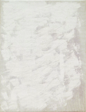
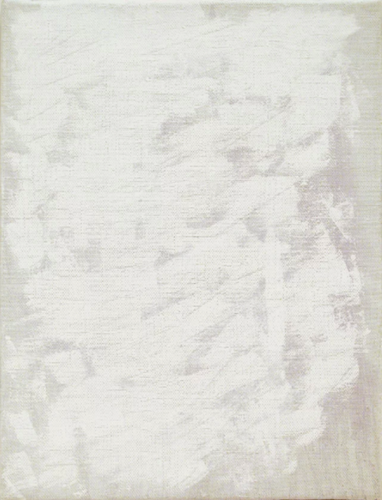
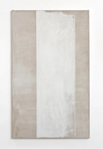
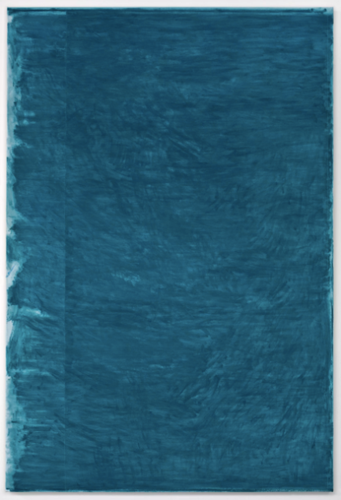
John Zurier’s abstract, nearly monochrome paintings are spare in form and substantial in presence. The true beauty of the works lies in their subtlety. Zurier’s pieces quietly demand that one looks and looks again to see all that is there - past the uniform tones of backdrop, the creases of canvas, the intention of marks and gestures, then pans back to the whole of what is there - to really see it.
John Zurier’s abstract, nearly monochrome paintings are spare in form and substantial in presence. The true beauty of the works lies in their subtlety. Zurier’s pieces quietly demand that one looks and looks again to see all that is there - past the uniform tones of backdrop, the creases of canvas, the intention of marks and gestures, then pans back to the whole of what is there - to really see it. There is more, something intangible about the blend of color, surface, density and light, a word that comes up often in my conversation with Zurier. His particular brand of alchemy is so exacting that the process is often years in the making, storing a piece then bringing it back into view many times over to get it perfectly right. In the viewer’s experience of a painting, he emphasizes the role of intuitive recall and subjective experience. “Paintings are not about memory. They touch something within our memory,” said Zurier. He continues that his approach is different with every painting. Each has a different application of brush and color to create a distinctive overall effect for that work. Essence is as much the quest as openness in his artistic ends, the revisions and evocation of which are interconnected. “My working process demands the ability to work in uncertainty. I don’t have a plan,” said Zurier. What he definitively does have is vision. He acknowledges that there is a fragility to it, an attribute that can be over or under imposed on the canvas and subsequently, undone. For Zurier, there is always a balancing act to maintain the integrity between what exists in his mind’s eye and on the canvas in front of him.
ArtDependence Magazine: How has the backdrop of living in two very different environments, Berkeley, California and Reykjavik, Iceland, influenced your work?
John Zurier: I have always been very interested in light and watching the weather and how it changes. In the Bay Area, the light is yellow and clear and Mediterranean. In Iceland, it is blue and crystalline and Nordic. Since my work is so much about color, the color of the light obviously has a big effect on me. I’m interested in different qualities of light, and spending time in these two very different places is good for me. There is a great song, “Don’t Forget the Northern Morning Light” by Benni Hemm Hemm, an Icelandic musician, and it captures the feeling I have about the light in Iceland.
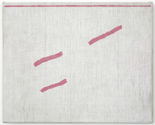
JZ: The marks and dabs are sometimes random, sometimes deliberate. Sometimes they might recall a fold or dent in the canvas that I saw when I first stretched it. They may harmonize, modulate or disrupt the surface and also bring your attention to it.
AD: How do you feel the audience’s experience of time and memory is affected by a work’s surface and color?
JZ: That’s a really hard question. You see the color and surface, and maybe then that triggers a memory or emotion that will take you to another time. I don’t think it is about nostalgia. The Swedish writer, Harry Martinsson, says we have as much control over our memories as we do our dreams.
AD: How do the structure and mechanics of painting impact the artistic product of your work?
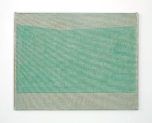
JZ: It is all about the materials for me. I use different types of canvas and linen, different grounds, I use oil paint and glue–size tempera which is also called distemper. Each painting is the result of what materials I choose to work with, as well as the size, the format, the depth of the stretcher, and so forth. I like open, dry surfaces that show the beauty of the pigment.
AD: You have said: “I think the Japanese painter Ike No Taiga was right, the most difficult thing to achieve in painting is creating a space where absolutely nothing has been painted.” Describe the inherent difficulty in achieving this end.
JZ: Ike No Taiga was talking about activating an empty space, about giving a sense of presence within absence. It is about activating the Void. That’s really hard to do.
AD: At Frieze 2018, Peter Blum Gallery is showing a survey of your work from 2000-2017. What defines this era of your career as an artist?
JZ: The survey begins with work from 2000, but in fact, this era began in for me in 1995. I had been using a kind of representational language to make abstract paintings, but then I realized that I didn’t want to deal with deep space or illusions of space, just color and surface.
AD: You have said: “I am interested in the gap between abstraction and evocation, between what is determinate and indeterminate, direct and suggested.” What ideas exist in this space and how does it inform the content of your art?
JZ: It is about the ambiguity. Fairfield Porter said something to the effect that a metaphor is small but an ambiguity has no limits. It is about freedom, to be able to hold two or more opposing things together.

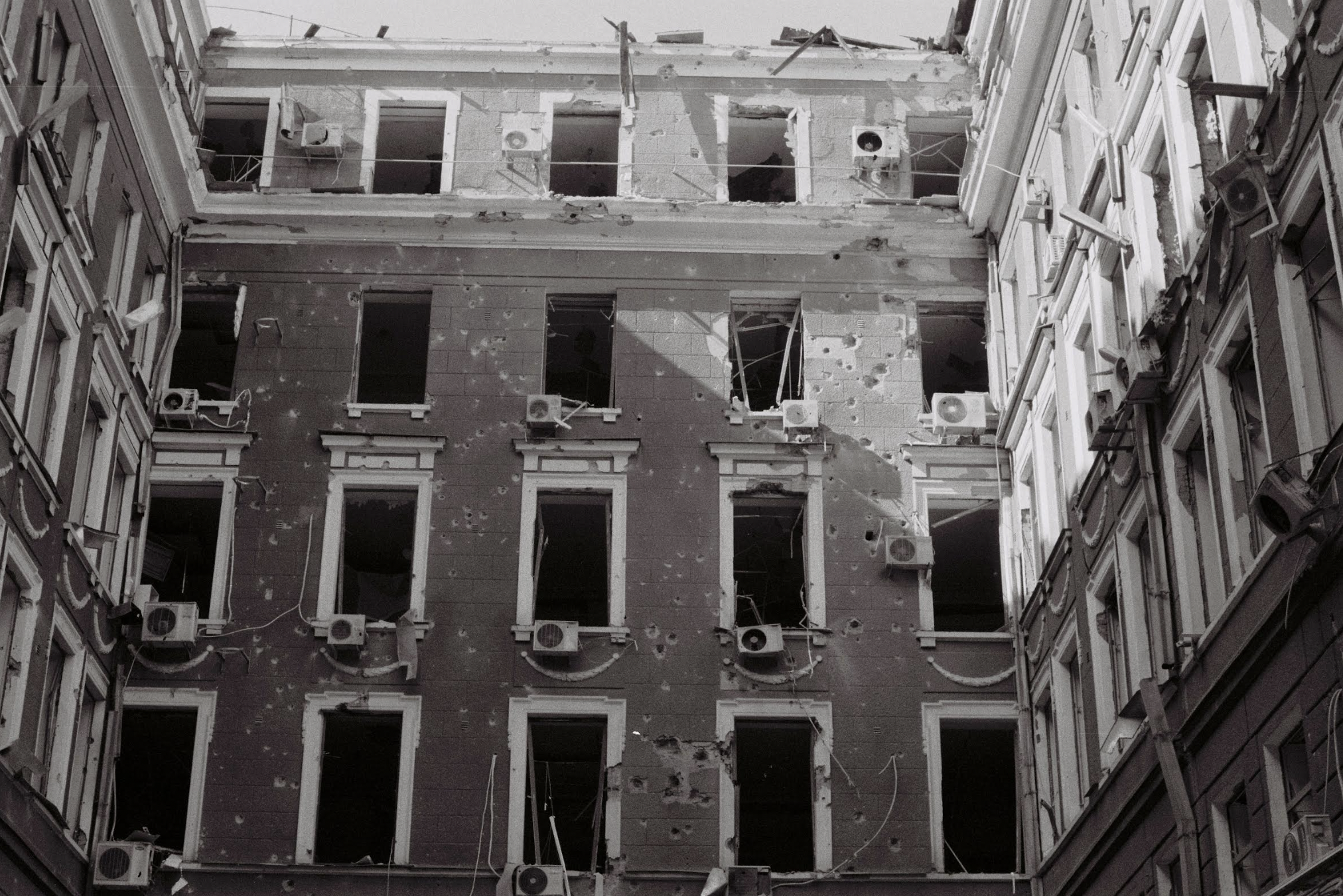
Anna Melnykova, "Palace of Labor (palats praci), architector I. Pretro, 1916", shot with analog Canon camera, 35 mm Fuji film in March 2022.
ArtDependence Magazine is an international magazine covering all spheres of contemporary art, as well as modern and classical art.
ArtDependence features the latest art news, highlighting interviews with today’s most influential artists, galleries, curators, collectors, fair directors and individuals at the axis of the arts.
The magazine also covers series of articles and reviews on critical art events, new publications and other foremost happenings in the art world.
If you would like to submit events or editorial content to ArtDependence Magazine, please feel free to reach the magazine via the contact page.